Radio
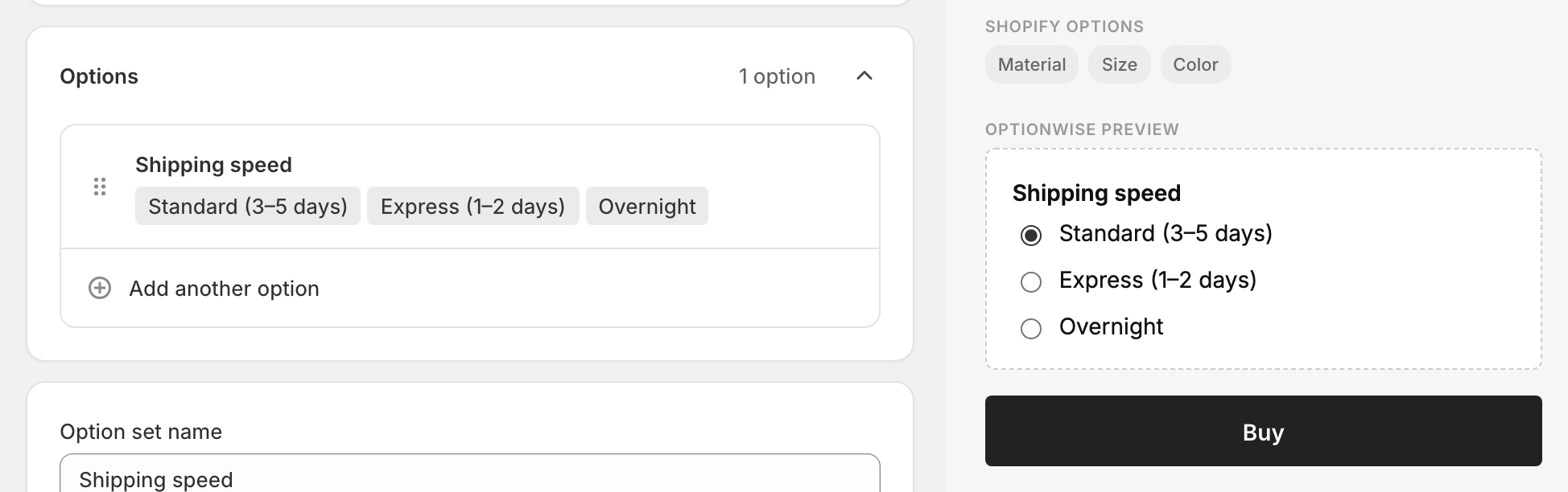
A single-select option that shows every value as a vertical list of radio buttons. Unlike a dropdown, all the choices are visible at once — good when the customer should be able to weigh the options side by side without opening a menu.
When to use it
- A short list (roughly 2–6 values) where seeing everything at once helps.
- The choice is important enough to keep in front of the customer.
- You want a plain, familiar control with no styling surprises.
For long lists, use a Dropdown. For tappable, more prominent choices, use Buttons.
Add a radio option
- In your option set, click Add another option.
- Set Type to Radio buttons.
- Enter an Option name (“Frame size”, “Delivery speed”).
- Add a value with Add a value, then Add another value for each one after that.
- Done, then Save.
Picking one or several
Radio buttons always let the customer pick exactly one value — that’s what radio buttons mean. If you need a list where the customer can pick more than one, use Checkboxes.
Advanced settings
- Default — the first value is preselected by default. Pick a different one from the Default dropdown, or choose No default so nothing is selected until the customer chooses.
- Validation → Required — require a choice before add-to-cart.
- Pricing — charge an add-on for a specific value. See Add-on prices.
- Visibility — show the option only after another choice is made. See Conditional logic.
What customers see
A vertical list of radio buttons with labels. Selecting one deselects the rest. The chosen value is added to the cart as a line-item property.
Related
- Dropdown — the same single choice in a compact menu
- Buttons — tappable list, can allow multiple picks
- Checkboxes — when several picks should be allowed