Dropdown
A single-select option that shows your values in a compact dropdown list. The customer opens it and picks one. Because a closed dropdown takes up a single line no matter how many values it holds, it’s the best choice for long lists where buttons or swatches would wrap awkwardly.
When to use it
- The list of values is long (sizes, finishes, font choices).
- Vertical space on the product page is tight.
- The choice isn’t visual — there’s nothing to gain from showing swatches or buttons.
For short lists where you want every value visible at a glance, use Buttons or Radio. For colors or material previews, use color or image swatches.
Add a dropdown
- In your option set, click Add another option.
- Set Type to Dropdown.
- Enter an Option name (“Size”, “Font”).
- Add a value with Add a value, then Add another value for each one after that.
- Done, then Save.
Picking one or several
Dropdowns always let the customer pick exactly one value. If you need a list where the customer can pick more than one, use Checkboxes or Buttons instead.
Advanced settings
- Default — by default the first value is preselected. Pick a different one from the Default dropdown, or choose No default to force an explicit choice.
- Validation → Required — require the customer to choose before adding to cart.
- Pricing — charge an add-on when a value is chosen. See Add-on prices.
- Visibility — show the dropdown only after another choice is made. See Conditional logic.
What customers see
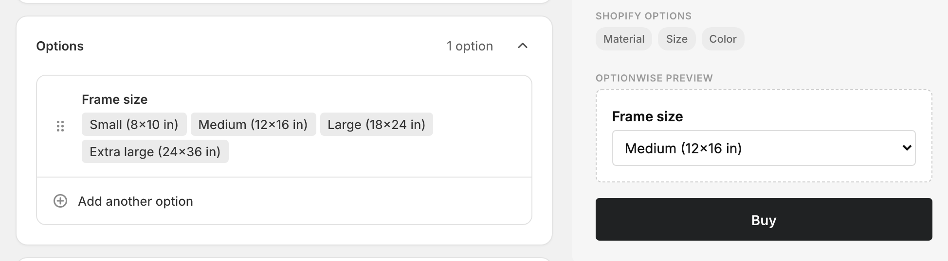
A standard dropdown next to your option name. The chosen value is added to the cart as a line-item property, so it carries through to checkout and the order.
Related
- Radio — the same single choice, shown as an open list
- Buttons — tappable, can allow multiple picks
- Add-on prices — charge more for specific values