Buttons
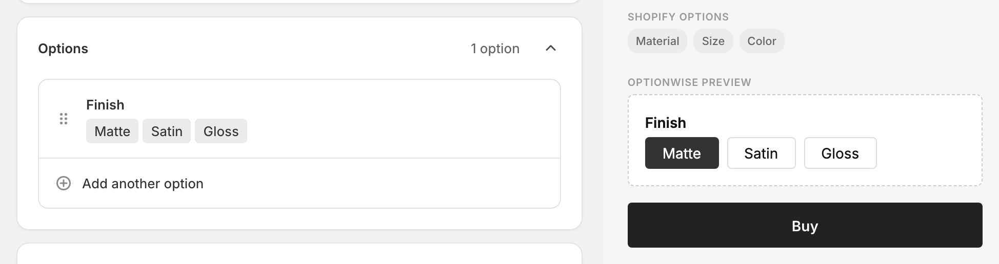
Shows each value as a tappable button laid out in a row. Buttons are larger and more inviting than a dropdown, and the large tap target works well on mobile. By default the customer picks exactly one, but you can let them pick several.
When to use it
- A short list of values you want visible and tappable (sizes, quantities, styles).
- Mobile shoppers — buttons are easier to tap than a dropdown or radio list.
- Add-ons the customer can combine, when you switch on multiple selection (below).
For long lists, a Dropdown stays tidier. For colors or images, use color or image swatches.
Add a buttons option
- In your option set, click Add another option.
- Set Type to Buttons.
- Enter an Option name (“Size”, “Add-ons”).
- Add a value with Add a value, then Add another value for each one after that.
- Done, then Save.
Picking one or several
By default, only one button can be active at a time (like a radio). To let customers pick several, open the option’s advanced settings → Validation, and raise Maximum selections above 1 (or leave it blank for “no limit”). When more than one is allowed, each button toggles on and off independently.
Advanced settings
- Default — in single-select mode the first value is preselected. Pick a different one, or choose No default.
- Validation — set Maximum selections to allow multiple picks, and Required to force at least one.
- Pricing — charge an add-on per selected value. See Add-on prices.
- Visibility — show the option only after another choice. See Conditional logic.
What customers see
A row of buttons. The active button is highlighted. In single-select mode, tapping one deselects the others; in multiple-select mode each toggles independently. Selected values are added to the cart as line-item properties (multiple picks are joined into one line).
Related
- Radio — single pick, classic vertical list
- Checkboxes — multi-pick by default
- Add-on prices — charge per selected value