Color swatches
Displays each color as a circular swatch. Customers tap a swatch to pick a color — by default just one, but you can let them pick several (see Multiple selection). Good for products where the color is the primary choice — apparel, accessories, homeware.
Pick image swatches instead if you want to show a product photo or pattern preview rather than a flat color. See Image swatches.
When to use it
- The product comes in distinct colors that customers choose between.
- The color is visually obvious and doesn’t need a photo to communicate.
- You want the choice to feel tactile — swatches are larger and more inviting than a dropdown.
For richer previews (textures, patterns, prints), use image swatches. For long color lists where space is tight, use a dropdown.
Add a color swatch option
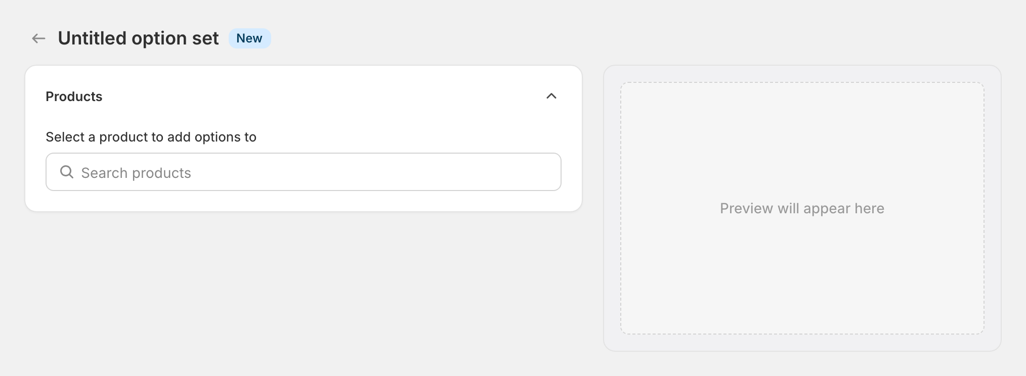
Open your option set
In the OptionWise admin, open the option set you want to add the swatch to. If you don’t have one yet, see Create an option set.
Add a new option
Click Add another option. A new option block appears with default fields ready to edit.
Set the type and name
In the option’s Type dropdown, choose Color swatches. Then enter an Option name — what customers see on the storefront (“Fabric color”, “Frame finish”). The cart line-item property name is generated automatically from the option name; if you need a specific property name (for a fulfillment integration, say), override it under Show advanced settings.
Add values
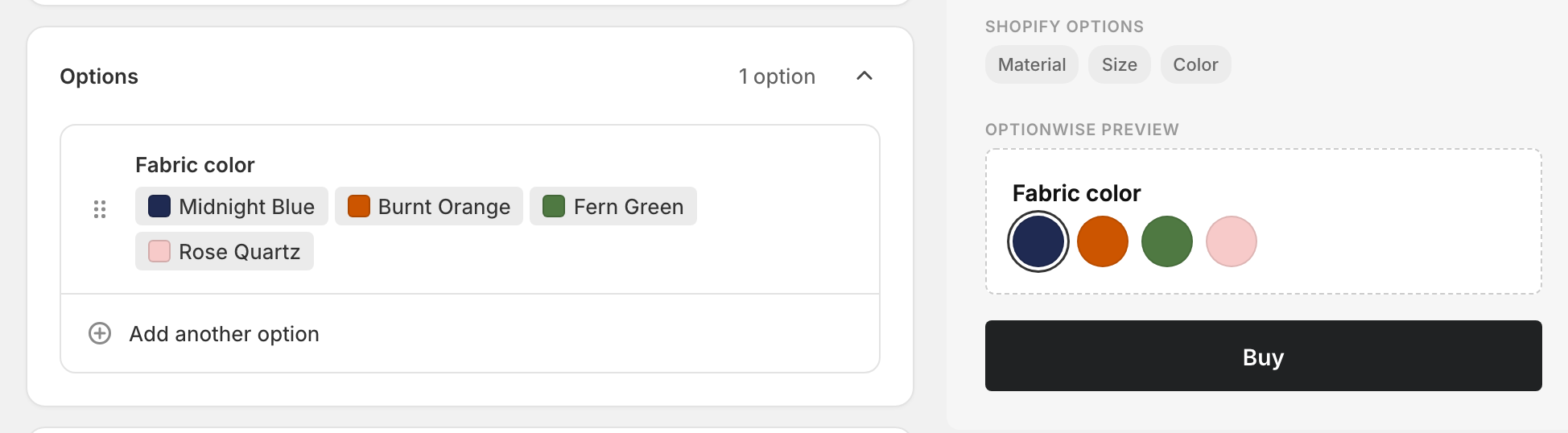
Each value is one swatch. Click Add another value for each color and fill in:
- Name — what the customer sees when they hover or focus the swatch (“Midnight Blue”, “Burnt Orange”).
- Color — pick the swatch fill. Use the color picker for an exact shade or paste a hex code if you have brand guidelines to match.
Save
Save the option set. If it’s already assigned to products, the new swatch appears on the storefront immediately — no theme republish needed.
Advanced settings
Everything below is optional. Skip to What customers see if you just want the basics working.
Multiple selection
By default, only one swatch can be active at a time. To let customers pick several colors (e.g. “pick three accent colors”), open the option’s advanced settings → Validation, and raise Maximum selections above 1 — or leave it blank for “no limit”.
Default value
By default the first swatch is preselected. To change this, pick a different value from the Default dropdown, or choose No default if you want customers to make an explicit choice before adding to cart.
Per-swatch pricing
If a particular color costs more (a premium finish, for example), expand the value’s Pricing panel and set the add-on amount. See Add-on prices for how this rolls up in the cart.
Visibility rules
To make this swatch only appear for certain previous choices (e.g. only show “wood finishes” if the customer picked “wooden frame”), open the Visibility panel and add a rule. See Conditional logic — setup.
What customers see
On the product page, the swatches render as a row of circles next to your chosen label. Tapping a swatch selects it; the selected swatch shows a ring outline.
The chosen value is added to the cart as a line-item property — so it appears in the cart, at checkout, and on the order summary.
Tips
- Always give swatches a name. Customers using screen readers don’t see the color, only the name. “Color: Midnight Blue” is meaningful; “Color: #1a2b3c” is not.
- Match swatch colors to the actual product. Hex codes from a brand style guide aren’t always what the manufactured item looks like. Use a photograph of the real product to pick the swatch fill if you can.
- Keep the list short. More than ~8 swatches and the row wraps awkwardly on mobile — consider a dropdown instead.
Related
- Image swatches — for pattern/texture previews
- Conditional logic — show swatches only for specific products
- Add-on prices — charge more for premium colors